Lighting Your Collection for Maximum Impact

Imagine you’ve just finished setting up a display of rare cobalt blue glass bottles and a set of high-polish vintage metal bottle caps. You step back, turn on your overhead room light, and realize the glass looks flat, the metal looks dull, and the shadows are swallowing the fine details of your most prized pieces. This post explores how to select the right light sources, manage glare, and use specific light temperatures to make your collection actually stand out. We'll look at how to highlight texture in metal, depth in glass, and the technical side of light placement.
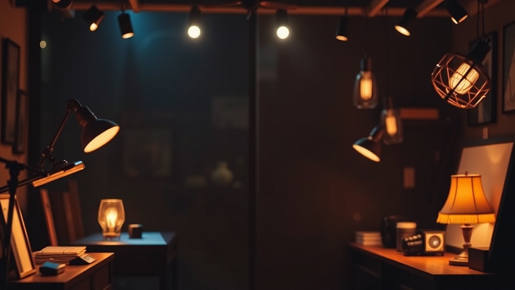
Lighting isn't just about being able to see your items; it's about controlling how a viewer perceives them. If you use a single, bright light source from directly above, you'll likely end up with harsh shadows that hide the very details you want to show off.
What is the Best Light Temperature for Glass and Metal?
The best light temperature for a mixed collection of glass and metal is a neutral to warm white light, typically between 2700K and 3500K. This range prevents glass from looking too "clinical" or blue, while also ensuring that the warm tones of vintage metal caps don't look muddy.
If you're displaying clear or colored glass, you need to be careful with Kelvin ratings. A high Kelvin number (like 5000K or higher) can make glass look incredibly crisp, but it often makes the room feel like a hospital wing. On the flip side, if you go too low—under 2500K—your colors will look yellow and aged, which might actually hide the true color of a vintage soda bottle or a specific metal patina.
Here is a quick breakdown of how different light temperatures affect your display:
| Light Temperature (K) | Visual Effect | Best For... |
|---|---|---|
| 2700K - 3000K | Warm, cozy, yellowish | Vintage brass, antique metal caps, amber glass |
| 3500K - 4000K | Neutral, clean, white | Mixed collections, modern glass, clear bottles |
| 5000K+ | Cool, blue, daylight | Highlighting transparency, clinical displays |
When you're dealing with highly reflective surfaces, the light temperature matters less than the light's quality. A single point source of light will create a "hot spot"—that tiny, blinding white dot on a curved bottle or a metal cap—which ruins the aesthetic. You want a light source that is slightly diffused.
How Do I Stop Glare on Glass Bottles?
To stop glare on glass bottles, you must use indirect or diffused light sources rather than direct, unshielded bulbs. Most collectors make the mistake of pointing a spotlight directly at the center of a bottle, which creates a massive white reflection that obscures the color of the glass.
One way to solve this is through "grazing" or "side-lighting." Instead of placing the light in front of the object, place it to the side or slightly behind it. This allows the light to wrap around the curves of the bottle. If you are displaying a collection of vintage bottles, you might want to look at how glass color is influenced by light to ensure your display accurately represents the piece.
If you're seeing too much reflection, try these three methods:
- Use Diffusers: Place a piece of frosted acrylic or even a thin white cloth between the light and the object.
- Angle the Light: Tilt your spotlights away from the direct line of sight. If the viewer is looking at the shelf from a 45-degree angle, your light should be at a different angle to prevent the "flash" effect.
- Multiple Low-Intensity Sources: Instead of one 100-watt bulb, use three 20-watt LED strips. This spreads the light out and softens the edges of the shadows.
I've spent way too much time adjusting my own shelf setups because I forgot that glass is essentially a mirror for light. (Trust me, it's a frustrating way to spend a Saturday afternoon.)
Should I Use LED or Halogen Lights for Displays?
LEDs are the superior choice for most collectors because they produce very little heat and have a much longer lifespan. Heat is the enemy of any collection, especially if you are displaying delicate items or those with sensitive finishes.
Halogen bulbs are great for color rendering—they make colors look incredibly rich—but they get hot. If you have a shelf full of glass bottles or metal caps that might have delicate coatings, a halogen bulb can actually bake the air inside the bottle or cause thermal expansion in metal parts.
LEDs have a few advantages for the serious collector:
- Heat Control: You won't risk cracking glass through thermal shock.
- Dimming Capabilities: Most modern LED drivers allow you to dial in the exact brightness you need.
- UV Output: High-quality LEDs have negligible UV output, which is vital if you're displaying items that might be sensitive to light degradation.
If you are worried about the long-term integrity of your collection, you might want to check out the guidelines on light preservation from the Library of Congress. It's a deep dive into how light affects physical objects over time. Even if you aren't a museum professional, the science remains the same.
One thing to watch out for is the CRI (Color Rendering Index). If you buy a cheap LED strip from a big-box store, the CRI might be low, around 70 or 80. This means the colors will look "muddy" or "off." Look for bulbs or strips with a CRI of 90 or higher. This ensures that the red in a vintage soda bottle looks like red, not a brownish-orange.
When it comes to metal caps, the CRI is just as important. A low CRI can make the gold or silver tones in a metal cap look dull and lifeless. You want that high-quality light to pull out the luster without creating a blinding glare.
A common mistake I see is using "smart" lights that change colors. While it's fun to change your room's mood, it's terrible for a collection. A collection should look consistent. If you're showing off a set of rare metal caps, you want the light to be a constant, reliable factor. Changing the light color frequently can actually make it harder to judge the authenticity of a patina or a metal finish.
If you're displaying a mix of textures—like the matte finish of a weathered metal cap versus the high-gloss finish of a glass bottle—you'll need to balance the light. The matte surface will absorb light, while the glossy surface will reflect it. This means you can't use a "one size fits all" lighting approach for every single item on the shelf. You'll likely need to adjust the angle of your lights for each section of your display to ensure the metal doesn't look too dark compared to the glass.
The goal is a balanced visual hierarchy. The glass provides the "glow," and the metal provides the "detail." If the light is too bright, the glass becomes a blinding white shape. If it's too dim, the metal becomes a dark silhouette. Finding that middle ground is where the real work happens.